
What are wireframes
Practically speaking, wireframes are website diagrams made out of simple geometric shapes (like rectangles and lines). On the surface, they are a way to start visualizing what a website might look like before fully fleshing out its design aesthetic. However, any web designer will tell you that they shouldn’t be viewed as design artifacts. We’ve said this to our clients many times over – “these are not an indication of design direction, just diagrams for talking about content strategy on the individual pages of your website”.
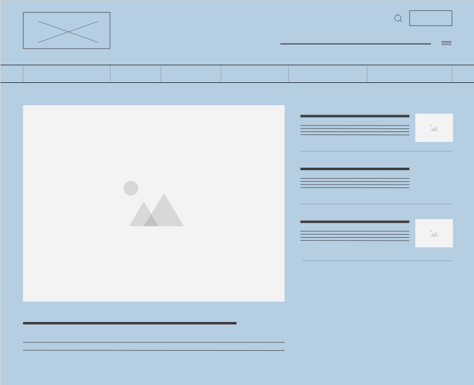 Sample section of a wireframe showing rectangular boxes that indicate the site logo, images, menus, and lines to denote text
So if we dig deeper, wireframes are a way to talk about content strategy on a per-page or per-template basis. They answer questions about what content is presented on which pages, in what order, and what user interface elements need to be present to support it. For example, it allows us to talk about whether a website’s homepage will start by highlighting a few timely pieces of content with links to learn more about each or by presenting an eye-catching tagline. This continues for all the content that’s presented on the homepage and every other page of a website.
With wireframes in hand, clients, designers, and developers are meant to have shared clarity about which content is given higher priority and how sections of content weave a compelling story.
The problem
The thing is, when we present a design artifact, which is to say a document that’s focused on communicating ideas in a visual way – no matter how many times we say that it’s not a design document, it still remains a design document. For designers, thinking visually is our happy place. But we’re using wireframes to communicate with non-designers. Especially when communicating with clients, this adds an unnecessary level of confusion and complexity.
Another part of the problem, is that creating design artifacts takes time. Even though wireframes are meant to be low-fidelity diagrams, they are created in design software. Yes, we can show clients hand-drawn wireframes, but digital wireframes are cleaner and clearer. Furthermore, since wireframes are meant to be visually simple, they also need a fair amount of documentation. This explains what content and functionality the basic shapes they are comprised of are meant to represent.
Ultimately, we’re creating design artifacts to talk about strategy. All the while repeating that they are not actually representative of visual design and that things might change as we get into fleshing out these diagrams into fully-designed page templates. But we are making strategy visual and setting up design expectations, no matter how many times we remind our clients that we’re not.
Brains are extremely powerful and prefer predictability. Clients might get attached to a particular layout in the wireframes. But sometimes when we get into fleshing them out as designs, we’ll find a more elegant solution or a reason why the layout we used to denote a particular section of content doesn’t work. Now, even if the fleshed out design is fantastic, the client will be a little disappointed, even if the new solution is great. So our choices are to lock ourselves into those layouts too early in the design process or create confusion, cognitive dissonance, and disappointment for our clients. Everyone is losing.
Our solution
Sometimes the simplest solutions are the best ones. If we strip away the visual layer of wireframes, what we’re left with is either a bullet list or a table with information about the sections on a given page from top to bottom. Adding a little text to clarify what content elements comprise each section and documenting any associated functionality, covers both the need to communicate strategy and document it for further project steps. It also requires no additional skills from the client aside from reading. Without the visual layer, we’re not locking ourselves into a specific layout nor having to explain that the visual layer is symbolic, not actual design.
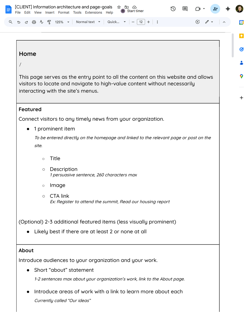 Sample page goals table for the top two sections of a homepage
Now what we have is a text-based document that facilitates discussions with the client and becomes the source of truth for not only visual design but also a jumping off point for the technical specifications document used by developers to build functionality. As a bonus, since the content sections are listed in order from top to bottom of the page, they are in what’s called “DOM order”. A fancy way of saying that they’re in order they would be presented to someone using assistive technology to explore the website. So we’re also contributing to the accessibility of a website from the very start.
Additionally, we’ll include content copywriting recommendations in the same document. For example, if an about blurb is meant to be pretty punchy and short, we’ll indicate a character range that would be ideal. And to add even more value to this document, we’ll include the strategic goal behind each content section. For example, that same about blurb might serve the need to quickly introduce an organization and start building a visitor’s understanding with an option to dive deeper through a button to learn more.
We call this the content page-goals document. It’s not the flashiest name but it accomplishes what it says. (very open to other suggestions!)
The Results
By using a text-based approach to talking about website content strategy rather than wireframes, we can dive directly into discussing said strategy without teaching clients how to read and understand wireframes. We don’t have to keep reminding them to focus on the message and not the package that message is wrapped in. Our strategic discussions are more productive and our strategic project phase is completed faster. We have a well-documented foundation for content development, visual design, and website development phases.
Clients do sometimes ask “but what will this look like”. Though this happens less and less often the more practice we have presenting this strategic document. Most clients just need a reminder that we will work through how things look during the visual design phase, and there will be plenty of opportunity for them to offer feedback towards revisions and refinement.
Conclusion
Have we completely done away with wireframes? For client presentations and discussions – yes! And we couldn’t be happier. Have we completely stopped wireframing websites? Of course not. They are still an extremely helpful part of the web design process, used internally by designers and developers. They offer a great and fast way to brainstorm layout options for whole pages and individual page sections. They are just not the vehicle we use to discuss content strategy with our clients.