
Heading structure
Your content outline likely uses section headings of the page or post you’re working on. This as a great jumping off point. You’ll want to format the bullets from your outline as actual headings in your website’s Content Management System (CMS). Many CMSs allow you to choose heading levels. There is:
- H1 or Heading 1 (your page’s title), then
- H2 or Heading 2 (the highest level section headings),
- H3 or Heading 3 (subsection headings),
- and so on until H6 (sub-sub-sub section headings).
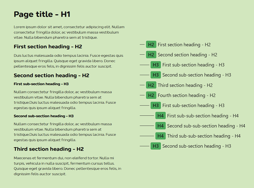 Side-by-side view of headings as they appear on the page (left) and the heading levels outline (right)
Screen readers can output the outline of any page by using the headings presented on that page. According to WebAIM’s 2021 Screen Reader User Survey, 85.7% of respondents found heading levels very or somewhat useful for content navigation. So keeping headings both meaningful and accurate improves the accessibility of your content.
This means that if you jump from an H2 to an H4 rather than an H3, the structure shown to visitors using assistive technology won’t be accurate. The first step is then to make sure that you’re not skipping heading levels in your content outline.
It can also be tempting to use heading formatting for text that isn’t actually a heading. Maybe you want to use the same font and thickness to highlight an important piece of text. But if that piece of text doesn’t make sense as a heading within your document’s structure, then it shouldn’t be set as a heading element. It’s best to find a way to apply formatting to it in other ways.
TL;DR
- use headings in order based on document outline level 1-6
- don’t skip headings, H3 shouldn’t be followed by H6 but either H4 or H2
- don’t use heading elements to style non-heading text
Scannability
Once the bird’s eye view of your document structure is settled, it’s time to flesh out your content. The first step, is to make your content easy to scan through. This is because online audiences first want to get an idea of the content on any given page they’re viewing by scanning through its content. This involves scrolling through a page while looking for specific keywords or phrases. The reason for this is it’s a good way to confirm that the content is relevant and helpful. Then they’ll zero in on the details and read more. (Read NN/g’s How People Read Online)
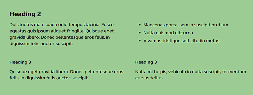 An example of scannable content that uses short paragraphs, headings, and a list
Using headings and subheadings is already a great start for breaking your content into easy to scan sections of text. Writing short paragraphs and using lists allows for even better scannability.
Using images can further add to content scannability. This is particularly true of images that add and support the meaning of your content. They will bring additional visual cues about the written content. This can also make your content more engaging but that’s a slightly different topic.
TL;DR
- use headings and sub-headings to segment your content
- write short paragraphs
- use bulleted or numbered lists
Readability
Now your page structure and contents are easy to grasp both for visitors using assistive technology and those who aren’t. It’s time to zoom in and the text easy to understand for everyone. Fixing grammatical and spelling errors is the first step.
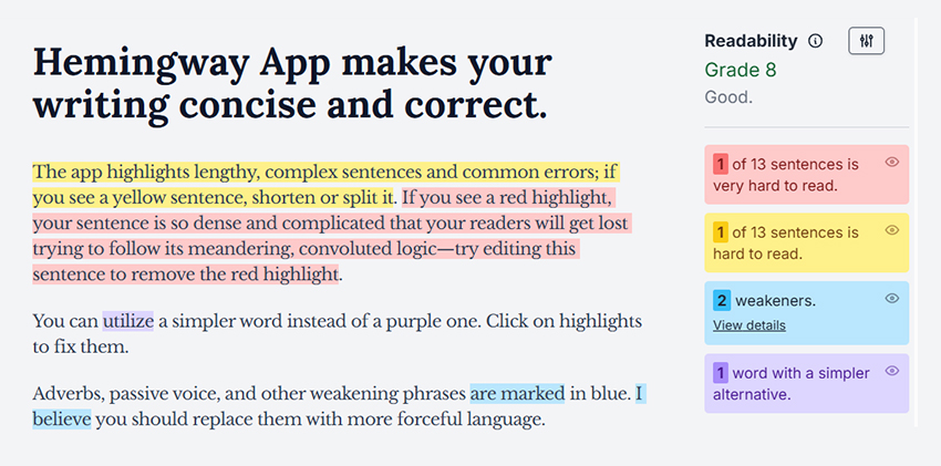 Hemingway App highlights sentences and words for improvement and grades text readability
If your content is intended for the general public, you’ll want to aim for readability aligned with roughly grade 8 education. Meaning that your text is easy to understand for someone with grade 8 education (Read W3C’s explanation of reading level requirement). This usually means avoiding sentences that run on too long and using more conversational vocabulary.
If your content is quite technical and intended for an audience with specific, technical knowledge, you can still provide a more accessible summary that will be inclusive to the general public. But this is not required.
Hemingway App is a great tool for editing your content to be more readable with sentence-by-sentence feedback.
TL;DR
- aim for grade 8 reading level
- write shorter sentences
- use plain language
- check spelling and grammar
Text formatting
Last but not least, zooming in on the formatting of your text is final step in writing content for accessibility. If your content offers a lot of important details or technical information, it can be tempting to highlight each detail by using bolding, underlining etc. For example, a how-to manual or procedure can fall into this category.
Alas, when everything is important in this way, the formatting becomes visually overwhelming. And then nothing is important as it all blends it together. So make sure that you’re not using bolded and italicized styles very frequently. Nor should formatting be used for long lines of text.
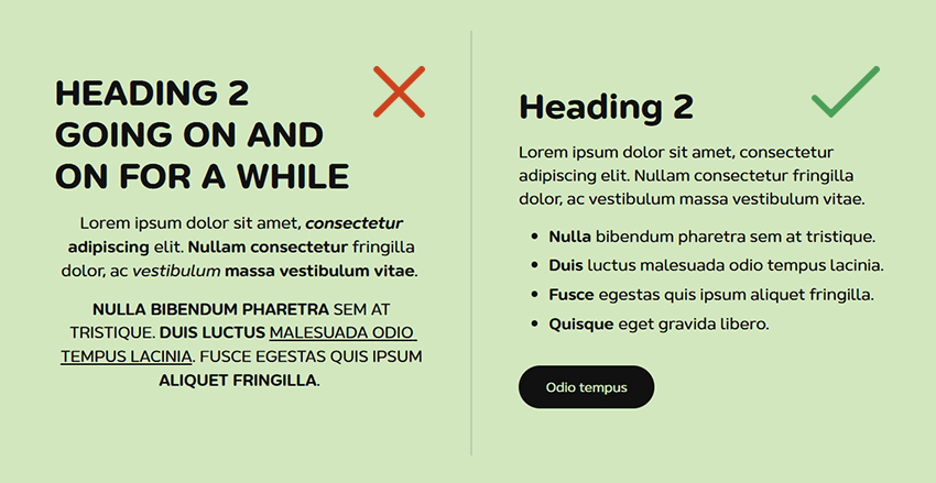 Examples of content that’s not formatted for accessibility and content that is
All caps text is also more cognitively difficult to read because our brains are used to lower-case letter shapes and recognize them faster. In fact, we don’t generally read every letter or even every word in sequence. So the easier it is for our brains to recognize familiar words the better. Screen reader technology will also often pronounce all caps text differently than sentence case text. The adage about not screaming at your audience might not be 100% accurate but it still holds valuable guidance. It’s ok to use all caps text for things like user interface (UI) labels or short headings. Beyond that, your content should avoid this formatting. (UX Movement’s article on all caps text)
Finally, if you’re writing in a language that’s read from left to right, like English. Then setting text to be left-aligned further improves its accessibility (WCAG’s guide for text justification). It’s ok to use center-aligned text for shorter phrases or buttons. Usually, your trusted web designer would have worked through these considerations while creating your website. When it comes to the vast majority of content presented on your website, center alignment should be avoided for all languages. Centered text breaks the natural flow of reading for both left-to-right and right-to-left languages, which makes it harder to read.
TL;DR
- use font styling sparingly to avoid overwhelm
- avoid all caps text
- use left-aligned text for left-to-right languages and right-aligned text for right-to-left languages
Your turn
You might already be following some of these guidelines. They’re foundational to not only accessible content but also align with many editorial best practices. And if they’re not part of your content creation workflow yet, adding them in as you plan new content will become second-nature with practice. Of course, you can also use these guidelines to audit existing content.
Read our accessibility guides
We’ve created a series of guides to help you create content that’s optimized for varied and wide audiences:
- Accessible layout & design considerations for content managers
- How to make your links accessible
- Image accessibility for content managers
- Accessibility tools for content managers
You can also take all of our accessibility guides with you in form of a PDF:
Download Our Accessibility Checklist for Content Managers