
Meaningful link text
Most links are text-based. A link might be a bit of text inside a paragraph, linking to another page with more information. Or it might be a more visually prominent button, asking to download a document. In either case, visitors who access your website via assistive technology, like screen readers, are able to request a list of links on any page. That’s right, just the links, without any additional context.
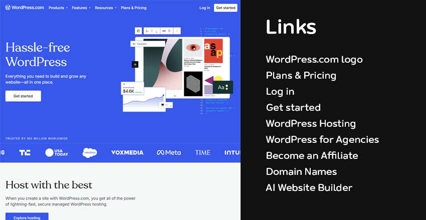 Left: How a landing page looks to sighted visitors; Right: The list of links from the same landing page as presented via assistive technology
With this in mind, making your link text meaningful will make it more helpful and accessible. So instead of “click here” or “read more” you might use “read our impact report” or “download our strategic plan”. Then it’s clear what you’re linking to even without any additional context.
One thing to keep an eye on is the length of your linked text. While you want to be helpful, a link that’s more than a few words long becomes cumbersome to read. The point is to make both linked text work well within the context of your content and without it. So aim for a happy middle ground where the link text is both meaningful and succinct.
Style
While the styling of links should have been worked out during the design of your website, there are often adjustments you can make within your content management system. If you do, the main thing to keep in mind that indicating a link solely by changing its text colour is unlikely to offer enough contrast. This will make your links difficult to distinguish and all the work you’ve put into making helpful connections will be for naught.
 Even if the link colour on the left offered more contrast the link on the right will always be easier to identify as a link
Therefore, use more than colour (like underlines and bolding) to make links easy to find.
Ideally, if you’re making link style adjustments, you’re considering your entire website. Making sure that links look consistent and easy to recognize from page to page.
External links
A pattern we see often is to make external links open in a new tab. The logic is that this preserves your website in one tab, making it easier to navigate back to. And this might be true for visitors who are using a mouse or trackpad for browser navigation. However, this complicates things for visitors using assistive technology. Often, hitting the “Back” button is easier using this technology than navigating between different tabs (Setting links to open in a new tab or window).
It’s best to set all links to open in the same tab.
If your website automatically adds an external link indicator icon to links that are external, then you’ve covered your bases by being accessible and user-friendly. Now visitors can decide for themselves if they want to open a link in a new tab based on whatever works best for them.
Your turn
Even the simplest of pages will likely have some links. Now you know how to make them helpful to the widest possible audience. With a bit of trial and error, adding your brand’s unique voice, you’ll be easily driving engagement with your site’s content.
Read our accessibility guides
We’ve created a series of guides to help you create content that’s optimized for varied and wide audiences:
- How to structure and write content for accessibility
- Accessible layout & design considerations for content managers
- Image accessibility for content managers
- Accessibility tools for content managers
You can also take all of our accessibility guides with you in form of a PDF:
Download Our Accessibility Checklist for Content Managers
Of course, if you’d like a bit of help, we offer accessibility auditing, training, and on-going support services.